TL;DR. Bright gold = warm, traditional luxury (think classic spirits and confectionery). Pale gold = cooler, modern, premium-tech feel (cosmetics, electronics). Champagne = soft, neutral, gender-neutral premium (skincare, beauty, premium FMCG). All three run identically on press — the difference is purely in the colour-coating layer of the foil.
“"Gold tone choice does more for perceived brand premium than any other single decoration decision on a luxury carton." — Pantone Color Institute, Color and Brand Perception 2024
---
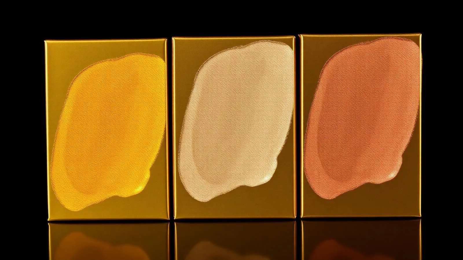
1. The three gold tones, side by side
| Attribute | Bright Gold | Pale Gold | Champagne |
|---|---|---|---|
| Closest Pantone match | 871 C | 872 C / 8642 C | 871 C @ 80% / Warm Gray |
| Hue feel | Warm, traditional | Cool, contemporary | Soft, neutral |
| Reflectivity | High mirror | Medium-high | Medium, satin |
| Brand vibe | Heritage luxury | Modern premium | Gender-neutral premium |
| Best contrast against | Deep red, navy, black | White, soft pastels | Cream, blush, sage |
| Common verticals | Spirits, confectionery, festive | Cosmetics, electronics, fashion | Skincare, beauty, FMCG |
You can see each grade on its product page: bright gold, pale gold, champagne.
2. How each tone is built (the colour-coating layer)
All three start identical — a vacuum-metallised aluminium layer (≈ 0.05 µm) on a PET carrier. The visible difference comes from the colour-coating layer applied below the metallic on the foil mill:
- Bright gold — yellow + warm orange dye blend with high transparency. Lets maximum light bounce off the silver mirror underneath.
- Pale gold — lighter yellow with a small green-shift dye to neutralise warmth. Often paired with a slightly diffused topcoat for a softer reflection.
- Champagne — desaturated yellow with a touch of red oxide. Often slightly matte/satin in finish.
This is also why all three run the same on press — same adhesive, same anilox, same speed. The only thing that changes is the foil roll. See anilox roller selection for cold foil for setup details.
3. Brand-fit guide (what each tone signals)
—Bright gold
- **Says:** premium, classic, celebratory, traditional - **Wins on:** spirits (whisky, cognac, Champagne), heritage chocolate, festive gift packaging, religious/cultural luxury markets - **Avoid when:** brand identity is minimalist, technical, or millennial-modern — bright gold can feel dated against pale neutrals—Pale gold
- **Says:** modern luxury, premium-tech, refined, restrained - **Wins on:** cosmetics (palettes, mascaras), consumer electronics gift boxes, fashion accessories, modern wine labels - **Avoid when:** brand needs warmth or "feast/festive" cues — pale gold can read cold next to red or burgundy—Champagne
- **Says:** softness, gender-neutrality, contemporary premium, wellness - **Wins on:** skincare, beauty (blush packaging), premium tea & coffee, candles, modern wedding/event collateral - **Avoid when:** the design needs high reflectivity or pop — champagne is the most subdued of the threeFor application examples, see our luxury cosmetic cold foil cartons deep dive.
4. Reflectivity & contrast — the visual math
Reflectivity (specular component, 60° geometry) measured on a calibrated gloss meter:
| Foil | Specular gloss (60°) |
|---|---|
| Bright gold | 78–86 GU |
| Pale gold | 70–78 GU |
| Champagne | 55–68 GU |
For high-impact retail shelf, bright gold draws the eye fastest. For restrained luxury (where the brand wants the consumer to lean in to read the carton), pale gold and champagne perform better in qualitative testing.
5. Pairing recommendations
| Background | Best gold partner | Why |
|---|---|---|
| Deep navy | Bright gold | Classic high-contrast luxury |
| Matte black | Pale gold | Modern, less "Vegas" than bright gold on black |
| Soft cream | Champagne | Tone-on-tone, restrained premium |
| White | Pale gold | Crisp tech-premium |
| Burgundy | Bright gold | Heritage, traditional |
| Sage / mint | Champagne | Wellness, organic feel |
| Hot pink | Bright gold | Maximalist, festive |
If you're overprinting CMYK to extend the gold gamut further, see CMYK over cold foil: building the rainbow effect.
6. Press behaviour — does any gold run differently?
Almost no. All three have:
- Identical adhesive requirements (same UV cold-foil adhesive)
- Same recommended anilox spec (500 lpi, 3.5–4.0 BCM)
- Same press speed range (150–450 m/min)
- Same release behaviour at room temperature
The only real-world difference is dust visibility: champagne and pale gold show white dust contamination more visibly than bright gold. Keep the press environment clean — that's it.
7. Cost comparison
All three sit at essentially the same price band — within ±5% of each other in $/m². The cost driver in your finished carton remains foil coverage area, not which gold you pick.
8. Quick decision tree
- Brand is heritage or festive → bright gold
- Brand is modern, technical, fashion-forward → pale gold
- Brand is wellness, gender-neutral, soft-luxury → champagne
- Still unsure → request all three on a printed proof of your dieline
FAQ
Can I print all three on the same job? Yes — multiple cold foil unwinds run the same press setup. Common in beauty palette ranges where 3–4 SKUs share a dieline.
Which gold matches best with rose-gold accents? Champagne. Bright gold next to rose gold can clash; pale gold reads slightly green next to it.
Are these the same hues as their hot-foil equivalents? Visually very close — most brand teams cannot tell bright gold cold foil from bright gold hot foil at arm's length on the same substrate.
---
See all three gold tones on real packaging samples. Request a sample pack and we'll ship printed proofs of bright gold, pale gold and champagne on your preferred substrate.
Sources & further reading - Pantone Color Institute - FSEA — Foil & Specialty Effects Association - Smithers — The Future of Foil Stamping to 2027