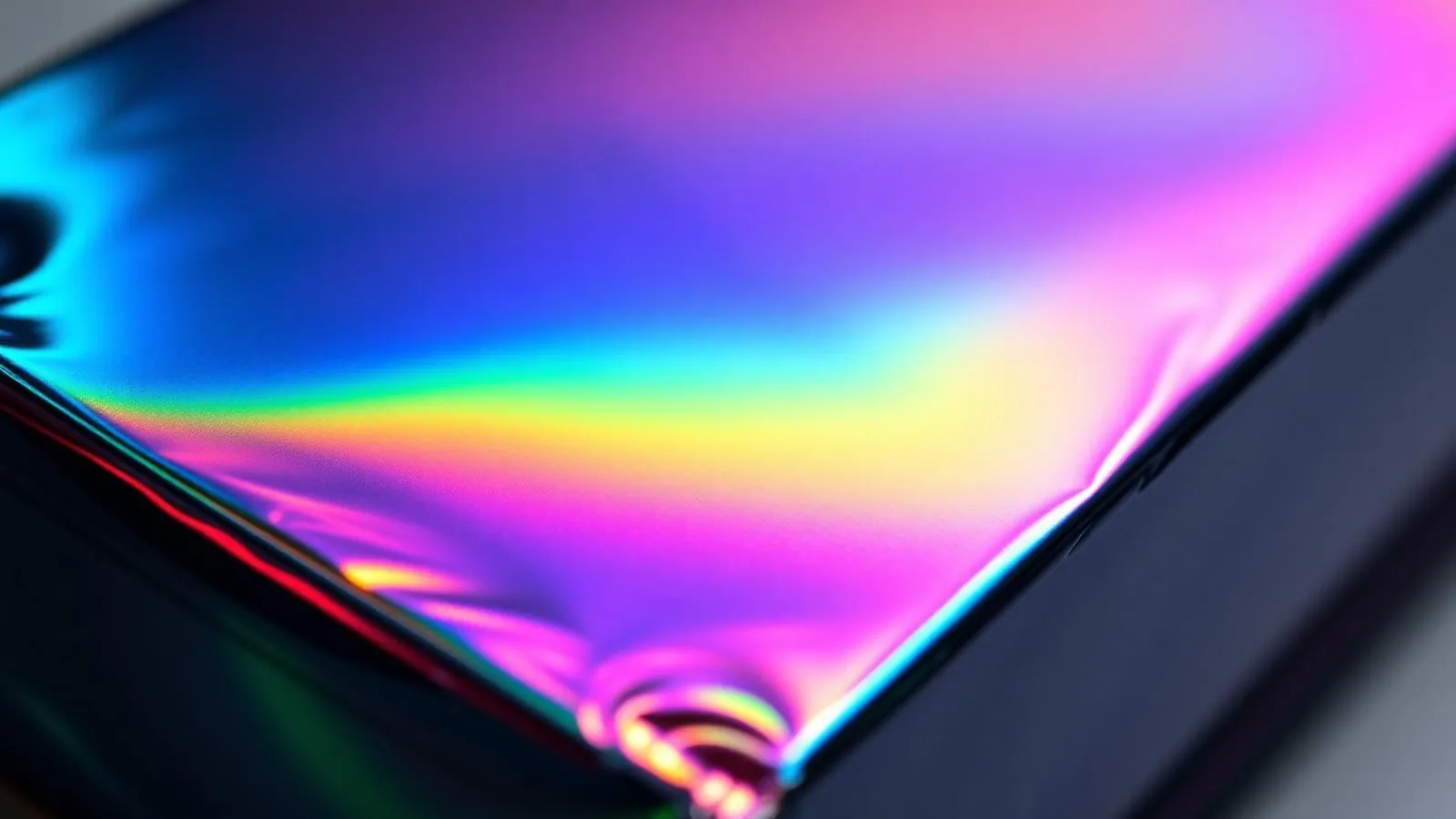
CMYK over cold foil creates colored metallic graphics by printing process inks over a transferred foil image, commonly silver. The reflective base remains part of the appearance when the ink film allows it to show through. A successful job needs more than a CMYK recipe: the foil grade, ink system, artwork separations and final finish must work together on the intended press.
For a packaging buyer, the practical question is whether the finished sample has the right color, metallic character and durability. A screen preview can help discuss the design, but it is not the acceptance reference for the finished effect.
How does CMYK over cold foil create metallic colors?
The foil provides the reflective base; the printed inks modify its appearance. This can produce several metallic hues within one design without changing the foil shade for every colored area. It does not provide an unlimited color gamut or guarantee a match to a paper-based color reference. ITW's cold-foil FAQ describes silver foil overprinting as a route to metallic shades such as gold and copper.
A graduated process-color image over plain silver can create a rainbow metallic effect. That is not the same as the diffraction produced by holographic foil. Decide which effect the artwork needs before choosing the material; adding a gradient to silver does not create a holographic pattern.
Plan the foil, white and color areas separately
Not every part of a package should be metallic. Mark the areas that need visible silver, colored metal, ordinary process color or a clean white background before building the separations. Selective cold foil can leave unfoiled areas: ITW's cold-foil basics explains how this preserves the underlying stock instead of covering the entire surface.
Use this planning matrix with the converter. It is a design checklist, not a validated production specification.
| Intended appearance | Artwork decision to discuss | What to inspect on a sample |
|---|---|---|
| Bare silver detail | Keep the intended foil area free of process-color overprint | Clean edges and the approved silver appearance |
| Colored metallic area | Place the color image over an overprintable foil area | Hue and retained metallic character after finishing |
| Nonmetallic white or process-color area | On white stock, consider leaving foil out of that area; if foil remains underneath, evaluate an appropriate opaque-white barrier | Whether the background is adequately hidden and the boundary registers cleanly |
| Holographic colored detail | Specify an overprintable holographic grade rather than assuming silver produces the same effect | Whether the pattern remains visible beneath ink and coating |
On clear label film, omitting foil leaves clear film, not a white background. Define the viewing side and required white coverage separately. For separation naming, trapping and artwork handoff, use the cold-foil prepress guide.
Match the press workflow and overprintable foil
In a typical UV flexo cold-foil workflow, adhesive is printed in the foil image, the foil is brought into contact, the adhesive is cured as specified, and the carrier is removed. Process-color overprinting follows on the transferred decoration. The carrier film is not the surface left on the label for subsequent printing.
Do not treat that description as a four-station equipment plan. CMYK has separate color channels; the actual units and order depend on the press, foil module, white and spot-color requirements, and finishing arrangement. Ask the converter to identify each operation on its press configuration. The flexo materials page and offset process page cover those distinct workflows.
KURZ's web-fed guidance identifies particular grades for UV flexographic overprinting. Its sheet-fed guidance describes inline and offline overprinting and material systems for UV and conventional applications. These are examples of grade-specific compatibility, not proof that every CFS foil accepts every ink or press setup.
Build the rainbow effect without a universal ink recipe
Evaluate the transparency of the printed ink film on the selected foil. Do not use "pigmented" as a synonym for "opaque," or assume a process-ink label alone establishes suitability. Ask the ink supplier about adhesion, curing or drying, and overprint compatibility for that foil surface.
Include a smooth gradient, representative midtones and the darkest intended area in a trial. Compare the printed patches before deciding whether to change separations or ink delivery. This is more informative than applying a generic black-channel cap or ink-film limit to unrelated ink systems.
For example, a rainbow ribbon beside white product text needs different artwork decisions from a fully metallic carton panel. The ribbon design can reserve white stock for the text; the full panel may require a tested white barrier beneath nonmetallic details. These are planning examples, not CFS customer case studies or tested color formulas.
Approve metallic color on the finished sample
Use the buyer's physical reference and a sample made with the intended foil, ink and finish. A target metallic gold should be evaluated as that complete construction, not declared equivalent to a named Pantone shade from fixed yellow and magenta percentages. Pantone's guidance on physical references explains their role in judging achievable color.
Agree how the reference and sample will be viewed, including lighting and viewing angle. Fogra's historical research on metallic-print characterization investigated angle-dependent measurements and their relationship to perceived metallic appearance. A color number alone should not be your entire acceptance description for an effect that changes with viewing conditions.
Color management still matters. ICC's characterization registry links datasets to specified printing processes and media. Ask prepress whether its profile and press curves represent the actual job; do not assume a coated-paper profile predicts metallic appearance, or that a universally applicable silver-foil profile is available. Record the approved separations and material combination with the retained sample.
Check ink adhesion and varnish compatibility in stages
A good foil transfer does not establish that the overprinted ink adheres well, and an acceptable uncoated print does not approve the final varnished construction. Retain samples at each stage so a failure can be traced to the operation where it first appears.
Include the finish in color approval: a matte coating may mute the metallic shine rather than preserve the uncoated appearance. ITW's finishing guidance discusses this difference. Evaluate the chosen coating or laminate on the actual print instead of selecting it from its name alone.
| Stage to retain | Inspection focus | Details to record |
|---|---|---|
| After foil transfer, before color | Coverage, edge definition and foil attachment | Stock, foil grade and lot, adhesive, press setup |
| After color overprint | Ink wetting, adhesion, color, and curing or drying behavior | Ink series, separations, operating conditions and elapsed time |
| After varnish or lamination | Adhesion between layers, appearance, rub resistance and intended handling | Finish identity, application conditions and agreed acceptance checks |
Agree the test method, timing and pass criteria with the converter and buyer before the trial. This table is a record structure, not a certification procedure. The adhesion-test guide helps frame checks; the adhesive selection page addresses adhesive and curing-system questions rather than an ink-overprint guarantee.
If ink lifts but the foil remains, investigate the ink-to-foil interface. If the decoration lifts with the ink, examine the underlying transfer as well. Photograph what remains on the stock and what has detached. For offset piling, inspect the blanket and retained samples instead of applying a flexo-anilox correction to an offset press. ITW's grade-specific overprint guidance discusses piling resistance as a material-performance consideration. Use the defect photo guide for a broader investigation.
Prepare a useful sample request
Send the intended substrate, printing process, foil appearance, ink series, finishing method and a marked artwork or reference photograph. Identify which regions must remain metallic and which must look white or nonmetallic. Ask about a foil grade for evaluation rather than assuming a silver product is already approved for the entire construction.
View CFS silver cold foil, request a foil sample, or contact CFS with those job details. If the project concerns a custom shade or supply specification, continue to custom cold foil. Arrange the printed and finished approval sample with the converter running the intended process.
Frequently asked questions
Can CMYK be printed over holographic cold foil? +
Some holographic grades are designed for overprinting, but the specific foil, ink and finish must be checked together. KURZ's web-fed information identifies such a grade; it is not a blanket approval for every holographic material. Compare the finished sample to the intended pattern visibility. See the holographic cold-foil guide.
Is a digital proof enough to approve the metallic effect? +
An ordinary paper proof can help check content and separations, but it does not establish the metallic appearance or adhesion of the finished construction. Agree a physical reference and a representative printed, finished sample for those approval decisions.
Is there one CMYK recipe for metallic gold? +
No recipe in this guide is offered as a universal gold match. Foil appearance, ink film, printing conditions and finishing affect the result. Start with the physical target and compare trial patches on the actual material combination before approving the color.