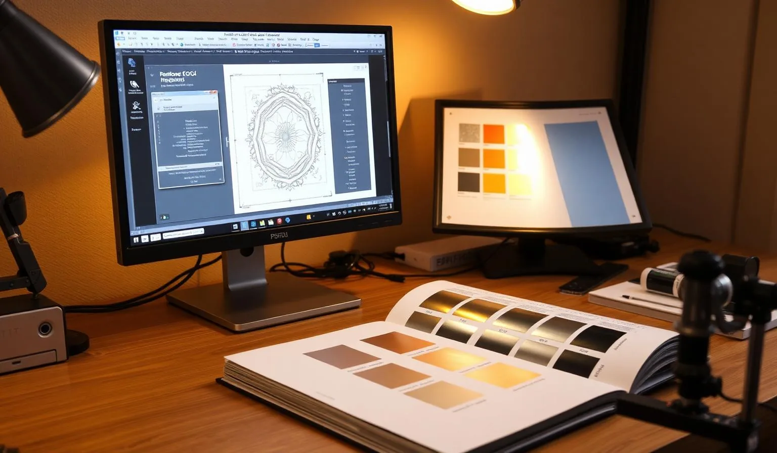
TL;DR. Cold foil prepress is not the same as hot foil or spot UV. Designers should: (1) build a dedicated foil spot color set to overprint, (2) keep minimum positive line width at 0.20 mm and negative at 0.25 mm, (3) add a 0.10 mm choke under CMYK that overprints the foil, (4) provide a separate dieline layer, and (5) request a physical foil-on-stock proof before signoff. Get those five right and you'll eliminate ~80% of foil prepress reworks.
“"More than half of cold foil reworks we see at the converter are avoidable at the design stage. The fixes are simple, but they have to be in the file before plates are made." — Linemark, 2026 Designer's Guide to Cold Foil Packaging
---
1. Why cold foil is different from hot foil at the file level
In hot foil, the foil shape is cut by a heated metal die. The designer hands off a vector silhouette; the converter handles everything else.
In cold foil, the foil shape is printed by a UV adhesive plate, then process inks may be overprinted on top to create coloured metallic effects (see CMYK over cold foil). That means the designer has to:
- Build the foil as a spot color separation that goes to its own plate.
- Decide what overprints what, in what stacking order.
- Manage trapping between foil and CMYK independently.
- Match the foil tone — bright gold vs pale vs champagne — to a real foil swatch (gold tone guide).
If you treat cold foil as "just a 6th colour" without these decisions, plates get made with the foil knocking out CMYK, and the press operator has to make compromises that the brand will see on shelf.
2. The minimum file checklist
| Element | Specification |
|---|---|
| Foil spot color | Named FOIL (or FOIL_GOLD, FOIL_SILVER), set to overprint in swatch attributes |
| Minimum positive line | 0.20 mm (≈ 0.6 pt) |
| Minimum negative line | 0.25 mm (≈ 0.75 pt) |
| Minimum type size | 6 pt sans, 7 pt serif |
| Foil registration to CMYK | ±0.10 mm tolerance; design with 0.10 mm choke |
| Bleed | 3 mm |
| Dieline | Separate layer, named DIELINE, set to overprint, non-printing |
| Total ink + foil coverage | ≤ 300% on adhesive area |
| File format | Native AI/INDD + PDF/X-4 with all spots preserved |
3. Spot color & overprint logic
Build the foil shape on a single spot color swatch. Set the swatch attributes to:
- Color type: Spot
- Color mode: any solid LAB or CMYK for screen preview only (e.g., gold ≈ C0 M20 Y90 K10) — this never prints
- Overprint: ON
Then decide the stacking:
- 1Foil-only area — foil prints on substrate, no CMYK on top.
- 2CMYK over foil — process colours overprint the foil to tint it. The CMYK plate must be set to overprint, not knockout, on the foil colour. This is how you get rose-gold from silver foil + magenta tint.
- 3CMYK around foil — process and foil sit side by side. Add the choke described next.
4. Trapping & choke
Cold foil application registers to roughly ±0.10 mm on a modern web press. To hide misregistration:
- For CMYK that butts against foil → choke the CMYK 0.10 mm under the foil edge (foil grows into CMYK).
- For CMYK that overprints foil → no trap needed; CMYK plate prints across the full foil shape with no knockout.
- For fine type knocked out of foil → set type at minimum 0.25 mm stroke and outline the type; do not rely on the press to hold a 0.1 mm reverse.
The same logic applies whether you're designing a luxury cosmetics carton, a wine label, or a folding carton for confectionery.
5. Pick the foil tone before you design
The foil itself sets the visual ceiling. A designer who picks "gold" without specifying tone hands the brand decision to the press operator. Before final artwork:
- Get physical foil swatches from the converter (bright gold, pale gold, champagne, rose, silver, copper, holographic).
- Lay swatches on the actual substrate under D50 lighting.
- For CMYK-over-foil effects, also overprint a target CMYK build on the swatch and approve.
- Reference the bright vs pale vs champagne comparison when briefing the brand.
6. The dieline handoff
A clean dieline saves hours at the converter and avoids cutting through your foil.
- Use a separate, top-most layer named
DIELINE. - Use distinct spot colors per line type:
CUT(solid magenta),CREASE(dashed cyan),BLEED(dashed yellow),PERF(dotted). - Set every dieline swatch to overprint and non-printing.
- Keep foil at least 3 mm from any cut, crease or perforation — crease tools will crack metallic foil.
- Keep foil at least 5 mm from glue tabs — adhesive does not bond well to metallized surfaces.
7. Proofing — what to ask for, in order
| Proof type | What it tells you | When |
|---|---|---|
| Digital colour proof (Epson contract) | CMYK and overall colour match | Concept signoff |
| Foil swatch on stock | Real foil shade on the chosen substrate | Before final artwork |
| Press-emulation digital with foil simulation | Layout + simulated foil; OK for internal review | Internal review |
| Wet press proof on the actual press | True foil + CMYK overprint, true register | Final signoff before plate-up |
Never sign off cold foil from a digital-only proof. The metallic shift between simulated and real foil is the single largest reason cartons get rejected at first delivery.
8. Substrate notes the designer needs to know
- Coated board (SBS, FBB) — best canvas; sharp foil edges, even solids.
- Uncoated stock — accept reduced solid density and some pinholing; brief the brand. See uncoated paper guide.
- Metallised board — extreme caution; foil over already-metallic surfaces requires supplier validation.
- Recyclable mono-material — talk to converter early; certain barrier coatings reject UV cold foil adhesive. See is cold foil recyclable.
9. Designer's pre-handoff checklist
Run this list before uploading to the converter:
- 1Foil swatch is a Spot, named, set to overprint.
- 2No
FOILis set to knockout anywhere in the document (check Separations Preview in Illustrator/InDesign). - 3Minimum line widths and type sizes met.
- 4CMYK-over-foil zones set to overprint, not knockout.
- 50.10 mm chokes applied where CMYK butts against foil.
- 6Dieline on its own layer, all rules non-printing.
- 7Foil clear of cuts, creases, and glue tabs.
- 8Bleed = 3 mm; crop marks present; file is PDF/X-4 with all spots preserved.
- 9Foil tone confirmed with a physical swatch.
- 10Wet press proof requested.
If those ten items are green, your file will print clean. If any are red, the converter will either flag (slow) or guess (worse).
FAQ
Should I build foil as 100% K or as a spot color? Always a spot color. 100% K will be treated as black ink at the converter unless you flag it; spot-color named FOIL is unambiguous and shows up correctly in Separations Preview.
Can I use a gradient to fade foil to nothing? You can build the gradient, but the foil application is binary — adhesive is either there or not. Gradients render as halftone dots in the adhesive plate; below ~30% tint, dots are too small to hold foil cleanly. Specify a hard mask, or accept a textured look below 30%.
Does the same artwork run on any cold foil press? The artwork rules are the same. Tolerances vary slightly between presses. Always send your artwork to the converter for a prepress check before plate-making.
What about FOIL + spot UV in the same area? Doable but tricky. The spot UV varnish must be selected by the converter to bond to the metallised surface; many standard UV varnishes will not adhere. Get a sample first.
---
Want a designer-ready cold foil template (Illustrator + InDesign) with the foil swatch, dieline layer, and chokes preconfigured? Request our prepress pack — free for qualified packaging teams.
Sources & further reading - Linemark — Designer's Guide to Cold Foil - FSEA — Foil & Specialty Effects Association - Pantone — Metallics - Related on-site: CMYK over cold foil · Bright vs pale vs champagne gold · Luxury cosmetic cartons · Cold foil cost calculator